Color
Generally, how we perceive and interpret color is subjective, based on personal and cultural bias. Consider what colors are coded for baby boys and baby girls, what color a bride wears on her wedding day, and what colors are expected at a funeral. These expectations are regional - though as culture changes and becomes more global our biases shift.
What do you see first, her or her top?
On a more personal level, consider what colors are your favorite to look at and why. What colors are your favorite to wear? Maybe it’s black, because “it’s slimming and goes with everything” or like me you were told by your mother that navy looks good on you.
Regardless of how subjective colors are, scientists and artists have been working to understand and define what colors are and how they work together from a place of objectivity. Without writing a textbook about it, I’ll tell you that going down the color science rabbit-hole is not for the faint of heart. You will find excessively technical documentation on the physics and chemistry of color. You will learn that “primary colors” are different in different modes (light vs. pigment) and even considered subjective within pigments.
Here’s the thing, with all the research I have put into color, the most important concept for determining what colors look good on you is objectivity of color interaction. Your physical features have colors that interact with the colors of the environment you are in and the clothing and cosmetics you wear. These interactions are optical illusions your brain creates to interpret external stimuli. They are hardwired into our brains - and as most people have similar hardwiring, we can consider these optical illusions objective.
How we feel about color is subjective and can be changed. However, how colors interact with each other is objective.
You can choose your clothing and cosmetics based on how you feel about the colors, or you can learn to harness the power of optical illusion to harmonize with your coloring - making yourself appear as healthy and vibrant as you are.
The Three Characteristics of Color
Pick one object, anywhere in your eyeline. Pick one color on that object. The specific spot you are looking at has a color that can be described with varying degrees of precision in three ways - hue and temperature, value, and saturation. Moving even a fraction of an inch changes the amount of light it receives and the colors reflecting back at it - changing its color slightly. Anyone who has zoomed into a digital image knows how color changes from pixel to pixel.
Here is a description of the three ways I describe color, with examples.
Hue - Temperature
If you list the colors in the rainbow, I imagine you will say ROYGBV. Some will include cyan and magenta. The word hue relates to the names we assign to different parts of the visible light spectrum - Red, Orange, Yellow, Green, Cyan, Blue, Violet, and Magenta all are hue names.
Through the mixture of pigment and/or light sources, you can adjust hues to skew towards yellow or blue. Yellow leaning hues are considered “warm” and blue leaning hues are considered “cool”.
These adjustments are important when you consider our skin color - both the overtone (the most obvious color produced by melanin in the basal layer of the skin) and undertone (the subtle combination of hyper and hypopigmentation, skin thickness, and the subtle effects of lifestyle). In combination, the over and undertone will either lean cool or warm.
For a color to harmonize with our skin tone, the hue temperatures must be aligned or within close range.
Value
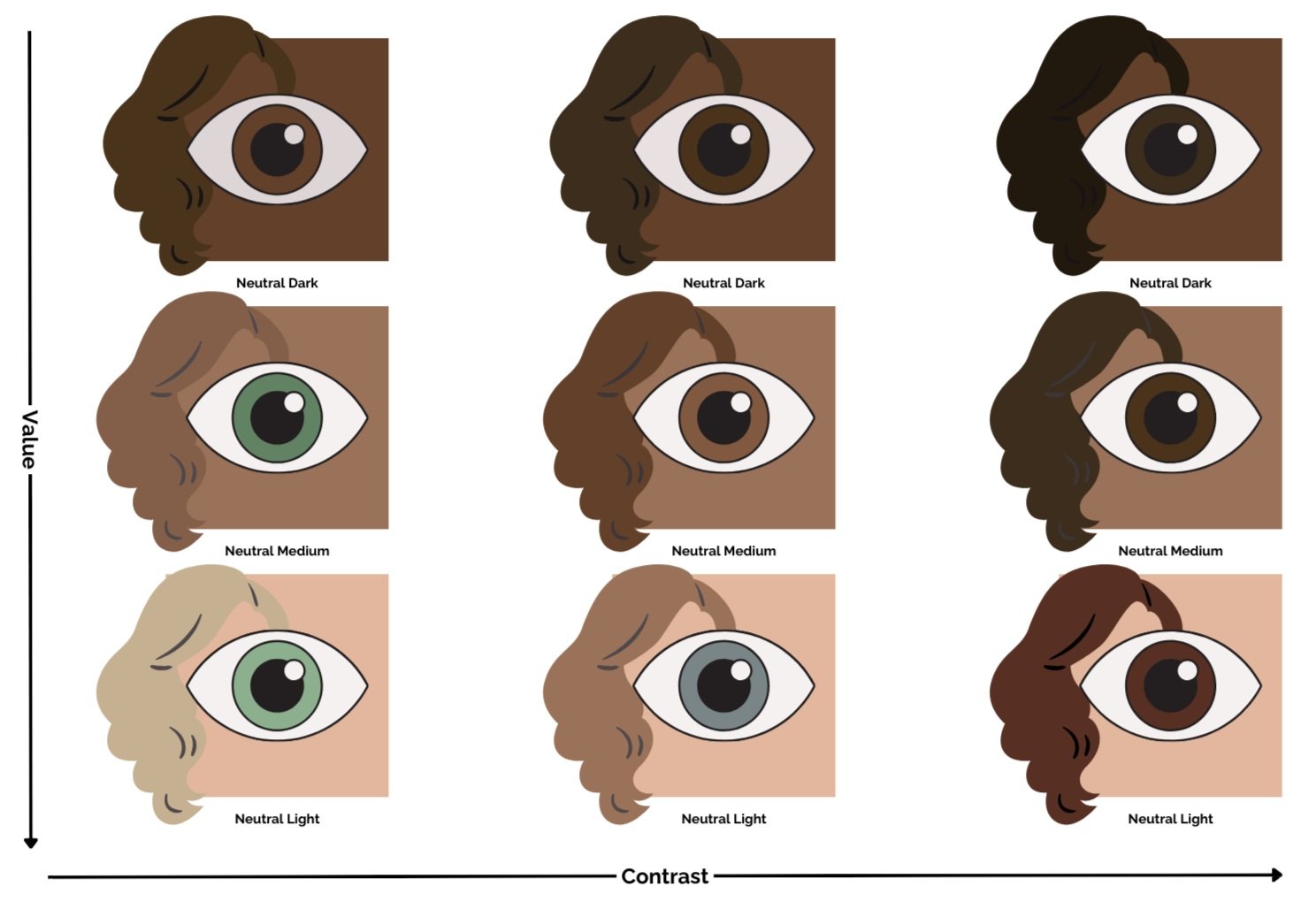
Value refers to the amount of black or white added to a color (adding any combination of black and white, essentially grey, changes a color’s saturation, see below). The higher a color’s value, the lighter it is. The lower the color's value, the darker it is.
More important than the value of skin color is the combination of values in the person’s coloring - as well as those features’ visual weight (or prominence.) This concept is deserving of its own blog post.
Essentially, if you would like your clothing to harmonize with your coloring you need to consider the value of your features’ coloring overall, as well as the intensity of your features’ value contrast, and make sure that the clothing you choose harmonizes accordingly.
Saturation
The print is so tiny! The color wheel on the left has grey added, to the right there is more brown, and on top, the color wheel has more pigment.
Saturation refers to how much pigment a color has. Bright colors are highly saturated and have lots of pigment, whereas soft colors have less pure pigment and are mixed with either grey or brown.
Soft colors mixed with grey can be considered “muted” and harmonize best with people who have cool, and soft coloring, whereas colors mixed with brown can be called “earthy” and flatter people with warm, soft coloring.
Note, this scale does not include the warm or cool versions of these skin tones, and obviously these do not go nearly as light or dark as the full range of human skin tones.
There Are No Ugly Colors
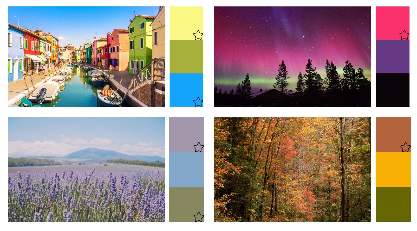
Many people consider certain colors to be ugly, using negative descriptions of colors like “muddy” or “dull” for muted colors, “garish” for bright colors, “Immature” or “silly” for light colors, and “depressing” or “heavy” for dark colors. These biases involve a combination of cultural influences and optical illusions.
These “ugly” colors come from discordant color pallets. Each is beautiful in its own way…. but when pulled together they are jumbled and bring out the worst in each other. Generally, the brighter colors come off looking best… leaving the soft colors pretty sad.
Objectively, there are no ugly colors. Instead, there are colors discordant with those around them.
I don’t know about you, but I find these colors beautiful when placed with colors they belong with.
But What About That Girl?
There she is… how does this apply to her?


If you look carefully, you may notice that her skin tone is soft, a greyish pink. So neutral-cool, soft. Her eyes are very dark, as is her hair, but her skin is medium-light. She has medium value contrast, and very low color contrast.
Based on the image, she’s a NC-S-D (Neutral Cool, Soft Deep) or in my color system a Dusky Soft Winter.
The color and pattern of her clothes are fun and gorgeous, but distracting.
She’s being a great model - the clothes are wearing her.
With my (admittedly terrible) photoshop skills I can tone down the color contrast of her skirt and top - and reduce the value and saturation of her blouse so her lovely face is what draws your eye.
Finally, for fun, because her coloring can take more contrast to balance out her hair and eyes, I added a little lipstick and eyeshadow - not at all necessary, with the changes… but fun, nonetheless.
Click her image to see the changes I made.


